Saturday, August 31, 2019

The New York Times Declares Stained Glass Ressurected. Rejoice. Or Don't.


Uh, it appears we are saved at last. Prepare to celebrate.  Or not.

Last week an article appeared in the “Style Magazine” section of the esteemed New York Times.
Under the rubric of the “Traditions” column, the headline read: “The Divine Resurrection of Stained Glass.”

Before I write another word, I need to issue an enormous caveat.  Here goes: I was really ticked off that the article didn’t mention me.  Yup—it insulted my big ol’ ego. Now, whining and moaning because a writer hasn’t heard the good news about how fabulous I am is pretty obnoxious.  So, I will say I have another horse in this race. I am someone who has devoted their adult life to working in the medium.  I have 35+ years’ experience as a maker and educator in the field. And while grand mission statements always seem ex post facto to me, I would say I had several intentions all along my journey, one being to exhibit stained glass as an art form and another to innovate the medium technically,  and yet another to create awareness of ancient media as perfectly viable vehicles for contemporary messages.

So: what about the article? Fasten your seat belts, here comes a rant.  First off, I like Nancy Hass’ writing style (with the exception of naming colors like the R and D department of a lipstick factory. What’s with that?) She has a way with words.  It was her “facts” that got me.
What a strange take on stained glass history!  It felt more than a little bizarre.  For such a short piece, Hass takes a deep dive right back to the Medieval, but really only to set up a lineage which is inaccurate and bizarre, to say the least.  Yeah, she probably got paid bupkis but just a little research might be nice.

“Though ubiquitous in churches since the High Middle Ages, when stained-glass windows taught the congregation Bible stories through imagery, it waned with the rise of unadorned Protestantism in the late 17th century. Morris made panes fashionable in the houses of the Victorian era, in shades of aquamarine, Kelly green and tangerine, to filter whatever sun could be found — a literal and figurative embodiment of enlightenment and, too, a canvas for his medieval motifs.”

There is increasing scholarship that disputes the “learning Bible stories” as the purported function of stained glass  (Thank you Rona Moody who cites Madeline Caviness).  As someone who has been to more than a few cathedrals, I will say, the impact of stained glass is far more than its narrative.  It’s more like a gut punch from the impact (abstract) of streaming colored light into a dark space. I know I can’t speak from a Medieval point of view, but it seems like common, human, bodily sense. And while it is true that stained glass waned with the rise of Protestantism, there was a lively secular tradition from the 16th c. onward. 
Did William Morris bring it back from the dead?  Ya know…I know Morris and Co. did a lot of stained glass, but I don’t really think of him as spearheading some kind of stained glass movement specifically. He didn’t really innovate the medium so much as apply his personal style to the same ol’-same ol’ execution.  It’s nice stuff, but hardly radical. It is true however, that the Arts and Crafts Movement revived stained glass.  Christopher Whall, Charles Rennie MacIntosh and Charles Connick might be more appropriately credited, although Morris is important cuz he’s an Arts and Crafts bigshot.
Hass goes on to cite Tiffany (but not LaFarge!!! And most definitely not Harry Clarke) and Albers and Frank Lloyd Wright and Le Corbusier. Another set of odd choices.  Not wrong exactly, but it feels like cherry picking. Where is Chagall? Or Matisse? One of the weirdest thinks about her history is that it’s sort of global, sort of USA.  (Her later case for her weird roster of revivers would make more sense if she just ignored Europe altogether!)  Hass’ history ends right there with the declaration: “but by the next decade [1960’s], stained glass came to be regarded as nostalgic Victoriana or hippie-ish kitsch. Contemporary art and architecture, wary of ornament and beguiled by monochromatic minimalism, had no use for it.”  Well…..let's see about that.

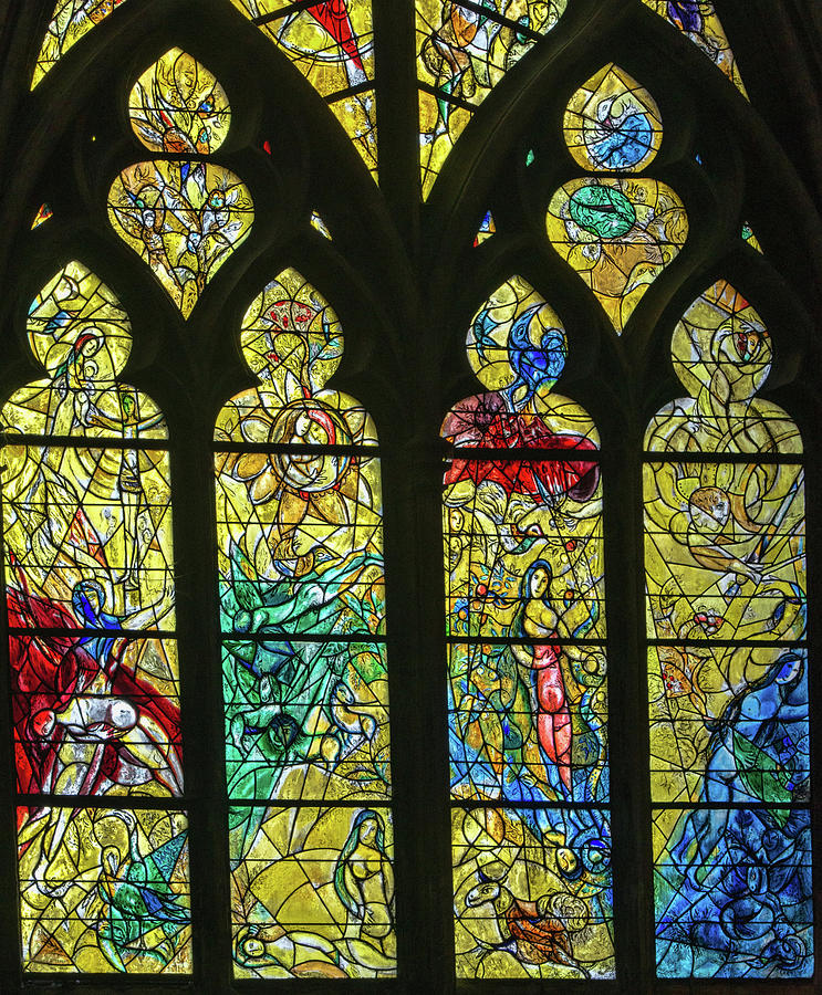
That history ignores what I think is the most important period of stained glass history since the medieval, and that is the post- world war European works by such giants as Schaffrath, Schreiter, Meistermann in Germany (check out this wonderful video by Sam Halstead!). The tradition I arise from was founded by Hans Gottfried von Stockhausen in Stuttgart and continued by many including my teacher Ursula Huth. It wasn’t nuthin’! Then there’s the UK…the amazing John Hutton and John Hayward and John Piper )…there are so many fantastic post war artists from the UK. Some even not named “John”!

I know what you’re thinking!!!  “But the author is right—who are those people, Judith?  If they were so significant why didn’t they make a splash in the art world?”  I do not disagree with the author’s subtext that stained glass became less important over the centuries. It has and for a variety of interesting reasons—none of which are that the work itself became crappier (although in every single art medium ever, there is plenty of crap if you are looking for it and stained glass seems to have produced a lot.  I have said in print before, it’s a medium that promises a lot in terms of message, transcendent experience and beauty and when it disappoints?  Man, does it disappoint!  It seems to “kischify” easier than oil paint for some reason.) 
I think it might be an interesting Masters thesis to write about why art, which we see as “sacred-ish” and “profoundly meaningful” and “intellectual” is deeply tied to the latest technologies (as opposed to ideologies) of its age.  Because in the age of microprocessors, the internet and space travel, I think stained glass damn well should be understood as yesterday’s news.  Yes, I SAID THAT.  I didn’t say it was irrelevant for that reason, or shittier or less worthy of respect…. it’s just old, technology-wise.  And that’s a solid fact.  If you are going to love stained glass, don’t pretend it’s something it’s not…it’s not nice to love someone for who you want them to be.  You must love them for who they are!  As it happened when stained glass first came to prominence it was the wildest, most advanced technology of its time.  As Nancy Hass says about William Morris’ work “a literal and figurative embodiment of enlightenment”—yes Nancy Hass, the Abbot Suger supposedly said in the 12th c.  “Stained glass is enlightenment embodied” and in 1100 it WAS just that!
It makes sense that if enlightenment is in disrepute, stained glass is going to suffer and morph into kitsch.

Anyway, Hass, has set up the scene for a “resurrection” …a word I always hear as “res-erection” because to me, seeing an old art form as somehow irrelevant or dead, further, to understand art at PROGRESSING to ever more avant garde forms of  avant gardishness  is to have a concept of time, art and progress that is very OEDIPAL and yes, phallic.  Its big and tall…not very wide.  It’s all  y axis, no x axis. Its all expansion economics, no contraction.
(Aside: technology progresses.  We have vaccines, computers, space missions now.  We didn’t have those before now.  But art?  It has not improved a single iota since 20,000 BCE.  Nope.  Not a bit.  But ya know what?  That’s an awesome fact.  Think about it and rejoice!  Art has illustrated Einstein’s theories of time. Again I eagerly await the thesis on the relationship of technology to art's "progress".)

Hass’ list of res-erectors are, like the rest of the article, truly strange choices.  We have the famous contemporary artists who have made (dabbled in) windows.  Kehinde Wiley and Amir H. Fallah.  This list ignores such luminaries as Kiki Smith, Gerhard Richter, Sigmar Polk, Judy Chicago, Wim Delvoye, David Hockney, James Jean and probably some more I am forgetting.  Never mind the implications of not fabricating the work (and how you can’t innovate a material if you’re not touching it--you can only apply modern thoughts to it), I like some of these folk’s work but I will say, as someone with a horse in this race: for the most part, like Morris and co. they just apply their jawn to the medium without “revolutionizing” it.  Take Wiley:  his work, to my mind, uses the trope of stained glass as a signifier of “the sacred (in European culture)” and does this with a Jedi-mind trick of replacing the expected characters with new, unexpected ones. Fine idea, but the glass was fabricated in the Czech Republic in the most pedestrian way possible. I think it sucks, personally, as stained glass.  Presumably, he doesn’t care about that so take what you will from what I say.  I love Amir H. Fallah’s work though—fabricated by the artists at Judson Studios (who also worked with James Jean).

Then there is the truly bizarre inclusion in the article of what I can only guess are her Instagram friends.  Not terrible work but hardly exemplars of revivalists, innovators or res-erectors.  A mobile made of beveled prisms?  Not the worst thing in the world but puh-leeeze…its hardly 360 joules to the heart of stained glass.  Hass seemed to focus on designers—but hey: she missed the stained glass car guy, Dominic Wilcox!  And the stained glass water tower guy, Tom Fruin!
-->
Here’s something the AGG or the SGAA could and should write an article about: the insurgent DIY stained glass movement which has its main venue as Instagram.
You know: I think most of that work isn’t quite ready for prime time—but I love that young people are loving stained glass and it seems they are doing it in droves.  This is an awesome thing!!  And it is a thing!  Its even trendy!

So, what’s missing from the article?  Artists who work in stained glass themselves and work in such a way as to innovate the technology and the message simultaneously and in concert with each other.  And my burning question: is Brian Clarke really “the lone voice for stained glass in the art world” for the past 40 years?  WELL, KILL ME NOW!!!  I have one thing to say and that is the word NO.  No, he’s not. 

Love 'em or hate em'  a brief list of stained glass movers and shakers off the top of my head would include JeffZimmer, Glenn Carter, Sasha Zhitneva, Rick Prigg, Marie Foucault Phipps, MaryClerkin Higgins, Troy Moody, Angela Steele, Pinkie Maclure, Tim Carey, Narcissus Quagliata, Helen Whittaker, and I know I am forgetting a bunch.  I am trying to get into my studio so I am rushing this off.

Nancy Hass, I wanted to love your article but all the above notwithstanding, how can you end with the Clarke quote that compares glass to plastic (even if he does mean the celluloid of movie film)?

And now I am going to take a few deep breaths and go back to my studio.  Thanks for listening!!


-->

Monday, July 15, 2019

"Efflorescence"

"Efflorescence", 31" x 41"
Looking at this as a finished piece, it looks like I just blorted it out effortlessly. But what a pain this one was!  And that's true for lots of human made stuff in this world--it looks easy peasy fait accompli-eezy once its done, but actually what appears to be a graceful gesture is more of a chaotic, inelegant rasslin' match. So here's a peek into the sausage factory.

First of all, I had the figure completed in glass about two years ago and it was sitting awaiting resolution.  As I am wont to do, I was hoping something would just dawn on me and I was hoping that this something would: 1. be fantastic to contemplate 2. be fantastic to look at  3. be above and beyond anything I have ever done before 4. Do justice, complement and otherwise work with the existing figure in terms of "stylistic execution" (for lack of a better term.)

Of course, despite all these grand intentions and conditions, I had NO CLUE WHATSOEVER what form any of them would take.  And that, in a nutshell, is why I think intentions in art are wack. Intentions, ideas...we all have them and they are all just wonderful until the rubber hits the road...and then, suddenly POOF!
I forget, remind me what the Buddhists say about expectations? (No, seriously, I remember!)

The face that launched a thousand snits
The source of all this agita was that I actually liked the figure I had made. This is always a recipe for disaster.  If I had felt more neutral or if I had even disliked the figure, I would have felt freer to be daring and experimental, after all there's nothing to lose and nothing to live up to.  The problem with achieving good results is that they demand more good results and the instant that becomes a condition of art making the whole process becomes very difficult psychologically speaking because now risk is dangerous instead of fun.
One of the weirdest things I had to do to make this piece happen was make a SECOND head. The reason for this is that I was convinced I would not do right by the first one....anyway, you may see her again, in other words.

So, while I said above that I hoped the "perfect" solution would just spring wholly formed into my brain complete with Ikea instructions, that isn't what happened.  What happened was I swam a lot of laps at my dad's apartment in San Diego.  Every lap I swam I thought about how to resolve the piece.  Is she falling out of bed?  Being attacked by a bear?  A wolf? Next to a pile of snakes?  In an abstract background?  What is she thinking about?  Is she an "annunciation"?  Is she falling?  Cringing?  Fearful?  Waking up? Just sitting there?

I tried really hard to have her be in a boat.


Here's an idea...or maybe not
As I swam, my brain trotted out all the known possibilities.  And that's the problem.  I already knew them...because I had, for the most part, already done them before!
Of course, if I knew the unknown possibilities, I would be psychic, such is the nature of unknown-ness.  But that's the whole game in creativity isn't it?  How to generate something new and different out of the ether into material form.

Well, I have said a lot about how I didn't resolve the piece and here's a sad but lucky and awesome fact: I can't tell you how I did resolve it either, because I was, indeed, blessed with an "aha"moment.  It was so brief I have no clue how to analyze it.  All I know is that I was, in fact, drawing and working on the piece (in Photoshop) when it happened. I wasn't swimming...all those laps for nothing!!!!  Please take note, creative types: I waited over two years for this to happen and was basically constantly on the lookout.  Dunno if that helped or sabotaged me,  but its a fact.

Despite what I said about newness being important this idea is not new-new.  I have dealt with barf many times before. That's probably because I am terribly phobic of vomiting.  I have also dealt with flower barf before.  I have certainly done a LOT with birds!  But there's all sorts of standards for newness and originality and this fits my "new enough so I can sleep at night" criteria. 

So, when I had my epiphany, I had been following the lead of  having the figure in a dark space reacting to a visitation of a large bird, like of some sort of "annunciation" (of what I do not know).  I have a lot of terrible thumbnail sketches most of which don't exist anymore. My last piece, "Sky Life" had the motif of birds carrying flowers in their mouths, so, being lost in the realm of "what I know" I considered repeating that motif, when BAM!  Instead of holding the flowers in order to transport them, I  thought, the bird should be crapping the flowers!  And then BAM!  No!  Not crapping but barfing! 
And I saw the sine curve that defined the trajectory of the spew.  Such a NICE LINE!  And that was that. Except, yes, I could use some Ikea instructions.  I always feel like a rank beginner when I make this stuff!

Ultimately, I can say that when I look at this piece as an observer myself, it is an image of a bird vomiting a really nice looking post Renaissance bouquet on a female figure in such a way as to somehow anoint her.  The vomit has an "ejaculatory" quality...its a come shot of sorts and all that might imply, so yes, its true to the idea of an annunciation!  What it means to me is to be showered in something beautiful that should be gross...as per usual, if your meaning differs that is a delightful thing.

Yes, I DO love Dutch still lives of the 17th c!
Three more things:
1.  A friend inform me that when a bird really, really likes you, it regurgitates on you in the manner of a mother bird feeding its chicks.  I did not know that when I designed the piece, but boy, does it ever fit the them for me, so I am claiming it as part of my inspiration, retroactively.
2. I named it "Efflorescence" because efflorescence refers to both a disgusting, frothy excrescence that erupts from dank basements but also implies some kind of flowering action.
3.  The cut line, (or solder line, if you prefer) that spans the upper third was something crucial to my excitement in making this resolution.  To me, it feels like an audacious stained glass design thing to do...to put a honking big, obvious sine curve RIGHT THROUGH the area of interest!  I found that oddly satisfying.

Technical notes: as per usual, the image is carved into the flash glass using hand tools, some plugged in and some not. There is also black vitreous paint fired on and silver stain and some pink. 
Three layers of glass comprise the background.  Lambert's Red on Clear 1001 r/clb, St Just 221 blue flash and Lambert's Au/cl.  On the red layer we have stencil black vitreous paint and silverstain. There is some pink cold paint--some of which I believe I actually removed from the blue layer as why bother?  I have the aurora!
Layers comprising the head.  See the other caption for glass used. 

Tuesday, April 9, 2019

Sky Life

Here are some images of a new piece I have been working on since last December.  Title, "Sky Life", size 70" x 38".

Note: the image is a photoshop composite as the piece hasn't actually been assembled at this time and it will not be possible to photograph it in the studio.  Ultimately it will be photographed in its new setting, a private home, in its architectural setting, in sunlight.  This composite was made by photographing sections separately and putting them together in Photoshop. It is an accurate representation of a studio shot, except for the "lead lines" which are just Photoshop black.

Here's the original sketch:


Technical details:  the entire piece is two layers of flash glass. St. Just French Antique flash glass in a teal blue on clear.  On top of that is Lambert's red on clear 1001/R/CB.
The image is generated (as my images often are) by working with the layers of flash--I begin by sandblasting to prepare the surface, but the subtleties of tone are accomplished by using engraving tools and diamond hand files.  I used black vitreous paint, silverstain and fuchsia Fusemaster enamel to enhance the engraving and to get yellows, blacks and pinks.  I worked on the glass pieces alone.
 

The piece will be a copperfoil construction, soldered into a steel rebar matrix, which I named "Skeletor".
Skeletor
Help assembling this piece came from Bryan Willette and Beyer's Studios--many, many thanks to them!!!

As for the subject matter: BIRDS.  BIRDS!!  I love birds.  I love drawing birds.  You know, when I was in high school, I was lucky enough to be able to take and AP studio art course and that's when I discovered Brancusi and tried to rip off one of his "Bird in Space" sculptures in soapstone.  It was an epic failure.  The form of birds has always appealed to me as has their vocabulary of parts: wings,  bullet-shaped bodies and heads and tails.  As characters, they come equipped with colorful outfits and don't have boring areas like thighs which human bodies have.  God how I get sick of rendering thighs.


Bird forms provide a limited structure that one can riff on endlessly and also an "excuse" to get involved with pattern and color in endless re-combinations of certain motifs--such as feathers.  So birds are like an alphabet of design elements from which one can create words, phrases, and gawd forbid, poetry.


 I had the idea that the piece would have millions of birds, most of which would be carrying a flower--which could be read as nest building (this piece is in a private home after all!) or as a symbol--birds are often seen as "messengers" and in Victorian times were often depicted "delivering" a key, a letter or a flower in their beak.  So these birds are doing some flower deliveries and of course they aren't just any flowers but, like the birds,  hallucinatory imaginary ones.


Why  hallucinatory, why imaginary?  First of all, I privilege these things as ta primary source of original material. Yeah, I admit it, originality is still important to me and yes, I recognize that we don't exist in a vacuum and any good imagination is being fed by a thousand streams of input. But its how you crunch that input and how, once metabolized deep within you, it gets ejected as something entirely new. 
Its hard to use your imagination once you are an adult--its trivialized and even denigrated. Its a distraction, its not empirical, its fabrications are...well, untruths. But too much research and reason and your art project turns into a social studies report.  Fine for some, but not my game. I like to keep it an inside job. 

Also, I am not a "visionary" in that I don't visualize my work a prior making it, but I admire so-called visionary art.  As for hallucinatory: I only took psychedelic drugs on two occasions and I didn't like them much. It rankles me to think we must source these images from a pill, when they are right inside us already! I am interested in transcendent experience.  Hallucinations seem to be generated from deep within us and to be an actual image of our neurology.  They reflect the deepest mental experiences relatively uninfluenced by nurture, culture and academia, to name a few corrupting agents!  (Just kidding....or maybe not.) I love the way some visionary art makes every element pulsate, vibrate, throb at some ridiculous amped up frequency as though it were suddenly a primal energy source, broadcasting transmissions like some cosmic radio tower.  Yup, that's a good look for any bird or flower!  And in the end what are they saying?  "Listen up  The world is alive!"


Sunday, January 27, 2019

Festival of technical


"Murdered Animal" 2018  see pics below!
It is no surprise, but I get a lot of technical questions.  Also, I get a lot of non-questions.  meaning, I hear or overhear discussion of the techniques I employ and its often incorrect.  So here's a post regrading all that stuff.
Remember, I post here under the tag demo, for more detailed information on specific pieces.

Some procedural details: first of all, I do not mind sharing.  I am happy to let people know how the look of my work is accomplished.  I invented very little of it (the file engraving being the exception), but I think my contribution is just how much of these techniques I use and my orchestration of them. Finally, I can tell in general how the work is made, but I can be very experimental and my procedures vary greatly.  So the descriptions here are in general.  in no way are they "rules" or even an accurate description of my methodology--it is in flux (glass pun!)

A few of the most common technical misunderstandings are: 1. "The work is painted" The look of my work is not the result of painting.  I do use paint, but comparatively little. I have heard people absolutely insisting that its painted. NO NO NO NO NO NO its not!!!!!  This is me speaking, and I am not only a first person witness to myself, I actually am doing this myself. What you are seeing is the results of engraving.  The only paint is black and yellow and sometimes pink.  The reds, blues, and any secondary or tertiary color made with red or blue is  the results of a combination of sandblasting and engraving. 

 2.  There is a technical difference between etching and engraving.  My work is not etched.  In both glass and metals, 'etching" refers to the use of acid.  Engraving refers to the use of tools.  My work is engraved.  Over and over again, I see people misusing these terms. Etching=acid, engraving= tools.

I start with a sketch-  I do not typically work with a complete sketch (and only very rarely do I work with a color sketch) as I like to leave many of the creative decisions (and the color choices) for when I am actually working with the glass.

Once I have some idea of what I want to do, I start cutting the glass.  The glass I use the most is called “Full Antique Flash Glass”.  I prefer Lamberts or Verriere St. Just, both hand blown and imported from Europe.  Flash glass is a type of stained glass with a paper thin layer of intense color on a lighter, thicker layer. Despite the name, the glass is not actually “antique”.  This glass has the advantage that the color can be removed by sandblasting and engraving revealing a contrasting area of color.

I use a regular steel wheel cutter to cut the glass and I also use the standard stained glass equipment of a grozing and running pliers to further refine the shapes. After the glass is shaped, I grind all the edges on a router type grinder.  I do this partly because I am still squeamish about getting cut  (after all these years!)

The next step is to do any sandblasting that needs to be done.  Sandblasting is a process by which one can remove areas of the colored layer by abrading the surface with sand at a high pressure.  I use a variety of resists to create stencils for sandblasting, including glue and masking tape, but the most common type of stencils I use are hand cut translucent adhesive vinyl or a photographic film that is glued to the glass.

Sometimes people think sandblasting is like an airbrush and can make a refined image.  However, I only use it to prepare the surface of the glass for engraving and to remove large areas of color.  It is a clumsy machine and I do not use it to make detailed images. 
And now we get to nitty gritty (also a glass pun!) After sandblasting,  I engrave smaller details.  I have several engraving tools.  Civilians would be reminded  of dentist drills. I use diamond ball burrs and cold water.  In conjunction with power tools, I also use diamond hand files to further refine the engraving.  This is the part of the process when the image gets its detailed, tonal look.  It also takes forever and can be physically painful.  
In terms of work, the cutting and sandblasting take a very short time, but this stage can take weeks and weeks.  To make a nice engraving of about 5" would take a day or so.

The next step is painting with glass paint.  The only color I use is black or very occasionally,  brown.  I paint it on and fire it in a 1250˚ F kiln to adhere it permanently.  I usually do 2-5 firings per piece of glass as that is the best way to get rich blacks and tonal variation.  I also use silver stain.  Silverstain, the origin of the term stained glass, is silver nitrate in a gamboge base--not really paint as it penetrates the surface of the glass and actually stains it yellow.  When it comes out of the kiln, the gamboge is washed off to reveal the yellow.  Lately I have been working with pink enamels.  (Note: the terminology is confusing, enamels, vitreous paints and stain are all different things to a stained glass artist, although they could all be sort of classified as "paint" since you paint them on.  They all fire on in a kiln and are permanent until the sun burns out and the universe collapses.)  I have been known to use a tiny bit of cold paint but only on windows to be displayed in lightboxes as it is not UV safe for all of eternity.
This is all the paint I use—most of the color in my work is the flash glass itself.

 One reason there is a lot of color in each section of my pictures is that the flash glass is layered--sometimes up to 5 pieces deep.  Some of the faces I’ve made have used a layer of blue on clear flash, a layer of brown on clear, pink on clear, and red on clear.  There’s no particular predetermined order—just what looks good.
Now regarding this procedure: 1. sandblast 2. engrave, 3. file 4. paint: I almost always go back and repeat many of these stages several times. Sometimes I engrave into the fired paint.  Until satisfaction is attained...or I give up the fight.

Once all the parts are done for a window, I assemble the piece using copper foil and sometimes lead.  In the layered areas, I use a wide copper foil.  Then I solder it together, frame it with zinc and it’s done!
Top: Blue flash glass, sandblasted and engraved
Top: Blue flash glass, sandblasted and engraved.  Bottom, Red flash glass, sandblasted, engraved, vitreous paint (stencil black #1059 Reusche)
All the blue pieces for the entire piece.  Sandblasted and engraved.  The pink is cold paint.
All the red pieces (plus the  blue lion), sandblasted, engraved, filed, vitreous paint (stencil black #1059 Reusche), silverstain #3

-->