Greetings. Those of you with an interest in the creative process may wish to note that completing "Super/Natural" did not result in feelings of massive satisfaction. Well--it did and it didn't.
While I feel it is without doubt the....how to phrase this....the bestestest project of my life, I had a lot of really big FEELINGS about this once it was suddenly cast into the past tense. I am very proud of it, I would never not want to have made it. But now what???
So, one feeling I felt was "why go on?" There's no way I want to compete with myself or try to somehow outdo it. Constantly ratcheting up the s creative stakes and going for the "next level" can be a real creativity killer (although I do believe there's a time and place for that type of thing). However, in this case, the next move has to be a leap into terra incognita. In addition, I've been going full throttle for 45 years, so there's some burnout here. Leaping around sounds a wee bit exhausting.
The cure for burnout is PLAY. Sadly, I have forgotten how to play. Or it feels like I have. I know a little about this. In order to play one must lower the stakes to basically zero. There can be no pressure to make anything in particular. That's the end of that sentence: its not make something good, to make something profound, to make something by a certain date or in a certain material; whatever. Play means not making anything at all that fulfills any sort of expectation whatsoever, zero conditions--full stop.
All this to say I have had a little bit of difficulty getting back on track.
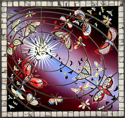
First piece: "Wondermoths". (34"x34" approx
I was playing. Mostly what I "want" when working is to make something amazing. Then I have to simmer down some and tell myself I just want to make ANYTHING. Don't ask me about intentions--that was the intention!
Its funny because in November I am speaking at CraftNow and the theme of the symposium this year is "intention". I have a lot of thoughts on how we overvalue intention when discussing art and I will be sure to let everyone know in Nov! But, the one sentence version of it is, at the end of the day, who cares? For example: maybe with "Wondermoths" I intended to make a piece comparing the gathering of insects by a light source to a solar system. Maybe I intended to say something about the attraction of light (which is a major obsession with stained glass artists if any of the AGG conferences I have attended is any indication.)
But the truth? My only intention was to make the thing. Every time I start thinking "what's it all about" I hit a massive choke point and the only way I can actually go on is to forget about intention. Just make the damned thing! I try to advise my students to think about this stuff when its DONE and not a moment sooner. The role of thinking in art is tricky. I don't want to encourage my students worst tendencies to be idiots. But as I said--intention is overvalued and I hate crits where a student gets rewarded for making the thing they thought of. I believe art is a process of making something you haven't though of! But its OK to figure out what it was you did later.
What does "Wondermoths" mean? you tell me.
Next piece, still in progress.
"Dirty Countertop"
I can't believe I am doing a still life! Why??? Oh god, why??
Composite sketch. Background is pencil, pen and photoshop. Fruits and veggies are photos of glass.
If you wish to read and learn about the dome, there is a brief essay at the bottom of this post.
Here are a bunch of photos (mostly) by Dom Episcopo
“Super/Natural” is a stained glass environment
representing a “three-tiered cosmos”.
In 2023, I became an artist in residence at the Penn Center
for Neuroaesthetics.This project is the
result of attending their lab meetings over the course of a year and a half and
is the time it took to complete the dome.
The dome is 8 feet high at its tallest and 5’6” in diameter.The windows were designed and fabricated by me.
The dome architecture was designed by me in collaboration with carpenter Patrick
Murray who contributed his architectural background and engineering skill.
I would like to express my immense gratitude to my parents,
Moselio and Barbara Schaechter. My father, who served as the chairman of
Microbiology at Tufts University for 23 years, awakened in me a love of
science—especially through his collection of antique mushroom books, with their
fantastic illustrations. My mother, former director of the League School of
Boston (now the League School of Autism), nurtured my curiosity about the human
mind from an early age through books and conversations. Thank you, Mom and Dad,
for your inspiration and support.
One of the research themes at Penn Center for
Neuroaesthetics is “the built environment and wellness”.It was there that I learned of
biophilicdesign. Biophilic principles are often used in hospitals and office buildings
to create “refresh rooms” and non-secular chapels—places to lower stress and
encourage feelings of serenity and peace. It comes as no surprise that reconnecting
with nature is healing. Like many urban
people, I myself have very rarely experienced wild spaces. I don’t own a car,
and I have been city-bound most of my life. Super/Natural is a response to that
condition.
Without delving too deeply into mysticism, it seems biophilic
design offers an opportunity to reconcile human consciousness with the
environment. It challenges the perceived divide between mind and body, person
vs nature, as well as the mental distinction between "interior vs.
exterior" or "self vs. not-self”, revealing it as a perceptual
illusion. While this distinction has practical heuristic value, it also fosters
loneliness and isolation.I suspect this
disconnection enables social and ecological harm. My goal was to create
something that “heals” this divide.
By situating the viewer at the center of a three-tiered
cosmos, Super/Natural invites contemplation of both inner space—how we
experience environments neurologically and psychologically—and outer space—how
we extend ourselves into our surroundings. I aimed to inspire reflection on our
interdependence with all life on Earth, encouraging an internalized sense of
connection akin to viewing the "blue marble," from within rather than
from the far-off perspective of outer space.We are ultimately connected to, not just observing nature.
Although I am not religious, I chose a chapel as a direct
reference to spiritual architecture that uses art for reflection, awe, and
transcendence. As a stained glass artist, I am acutely aware that my work is
exhibited in lightboxes, not in churches and temples as is traditional. Thus, I
have thought for years that I would like to make a “personal shrine” for a
single viewer. This goes against the convention of thinking in the monumental
terms suggested by cathedrals as well as many contemporary art venues. Western
culture tends to revere the huge and sublime while undervaluing the small,
intimate, and inscendent. This preference for grandeur creates physical and
psychological distance between the viewer and the stained glass. I sought to
collapse that separation. Moreover, stained glass in churches and public spaces
is almost always designed for a collective audience. In the age of mass media,
there’s a temptation to assume that reaching the largest number of people is
inherently better. Super/Natural challenges that notion by offering a
semi-private experience.
The imagery in Super/Natural references nature, but it is
entirely derived from my imagination. It is intended to evoke the sense of
nature as understood by a human mind—similar to the natural history images that
influenced my childhood. They are, ultimately, about invoking nature more than
depicting it. At PCfN, I learned that creativity is often tested using the
'Alternative Uses Test,' in which subjects are asked to generate as many uses
as possible for a common object—like a brick—within a limited time. The test is
scored across four dimensions(fluency,
originality, flexibility and elaboration).The flower and bird imagery in the dome was a challenge to my
imagination.How many flowers, birds and
bugs could I invent before my inspiration ran dry? What would this say about
the potential for the inventive capacity of drawing? I hope I have discovered
that imagination is potentially infinite!
Imagination is often thought of as frivolous or a waste of
time. But what could be more amazing than the extension of consciousness beyond
what feels possible, beyond reality? It
is my belief that expressing one’s authentic imagination is the most important,
radical thing we can do as conscious beings. It is my belief the mind can conjure feelings
of awe independent of external experience (and substances) and hopefully the
dome will prove to be an example of that.
One final historical link that bears mentioning is that the
botanical prints that inspired the work were often created by women as this was
a permissible art form for them in the 17th Century. No wonder they
are so amazing looking—all that artistic energy had to be funneled into this
one constricting art mode!
The composition is based on the cross-cultural theme of a
"three tiered cosmos". The ten panels at eye level represent
the "Earthly Domain". These panels consist of images of plants and
insects in a profusion of exuberant life. Below are ten panels of
wallpaper representing the "Under World". The imagery includes
roots, unhatched larva, buried bones, mycelium and other motifs of
underground. The "Heavens", the geodesic dome itself, contains
45 triangular panels. This area depicts a murmuration of colorful birds
and stars. Underfoot is a carpet of my design depicting a whirlpool,
mirroring the spiral of birds above.
Techniques
I use a material called "Flash Glass”.Flash glass is a type of hand-blown glass
with a paper-thin veneer of intense color on a base layer of lighter
color.One reason there is a lot of
color in each section of my pictures is that the flash glass is layered, typically
two pieces deep, red on clear and blue on clear with the addition of black
enamel and silverstain.
I cut the glass using a steel wheel cutter and a grozing or
running pliers.The next step is
sandblasting, a process by which one can remove the colored layer, to get
patterns and tones.After sandblasting,
I engrave finer details using rotary tools and create smooth tonal shifts in
color with diamond hand files.
When the engraving is done, I
add black enamel which fires onto glass permanently. I also use silverstain
(which is yellow). I used a fuchsia transparent enamel in places as well.This is all the paint I use--all the other
color is the flash glass itself.The use
of red and blue glass, combined with small amounts of black, yellow, and pink
enamel, produces a full-color spectrum within a single section of glass,
eliminating the need for a cut line.
The wallpaper originated from
two high-resolution images of previous stained glass windows I created based on
pencil sketches. These images were manipulated with Photoshop software to
combine them with stained glass-like transparency.
__
Here are the “Cliff Notes” supplied by Chatgpt:
Summary of Key Themes
Biophilic
design and reconnection with nature
Healing
psychological and social divides and creating connections
Interior
vs. exterior space and dissolving boundaries
Imagination
as a force for creativity and transformation
Resistance
to monumentalism in favor of intimacy
The
symbolic structure of the three-tiered cosmos
Technical
mastery of stained glass craft
Art as
a site for awe, reflection, and transcendence
These themes are interconnected, reinforcing the overarching
goal of Super/Natural to invite viewers into a deeply personal,
immersive experience that explores the connections between self, nature, and
imagination.
I am ecstatic! This is one of my favorite pieces of mine and I think one of the. best. Well worth doing twice! (or almost twice!)
The color and shape difference in the pictures are due to the fact that I was using my phone to document the repair. The original piece was professionally photographed (by photographer extraordinaire, Dominic Episcopo
Pic 1: Original portfolio shot before damage, Pic 2: X marks the smashed
parts, Pic 3: Finished restoration, Pic 4 (below) white arrows indicate
the two main differences in the original and the restored version. Top
arrow: new lead line, bottom arrow, removed old lead line)
This section RESTORED! (her body, the piece to her right and the piece above, amongst others)