Tuesday, September 27, 2011

Upcoming events


Please note the following :
My work will be included in the following group exhibitions coming up soon!!
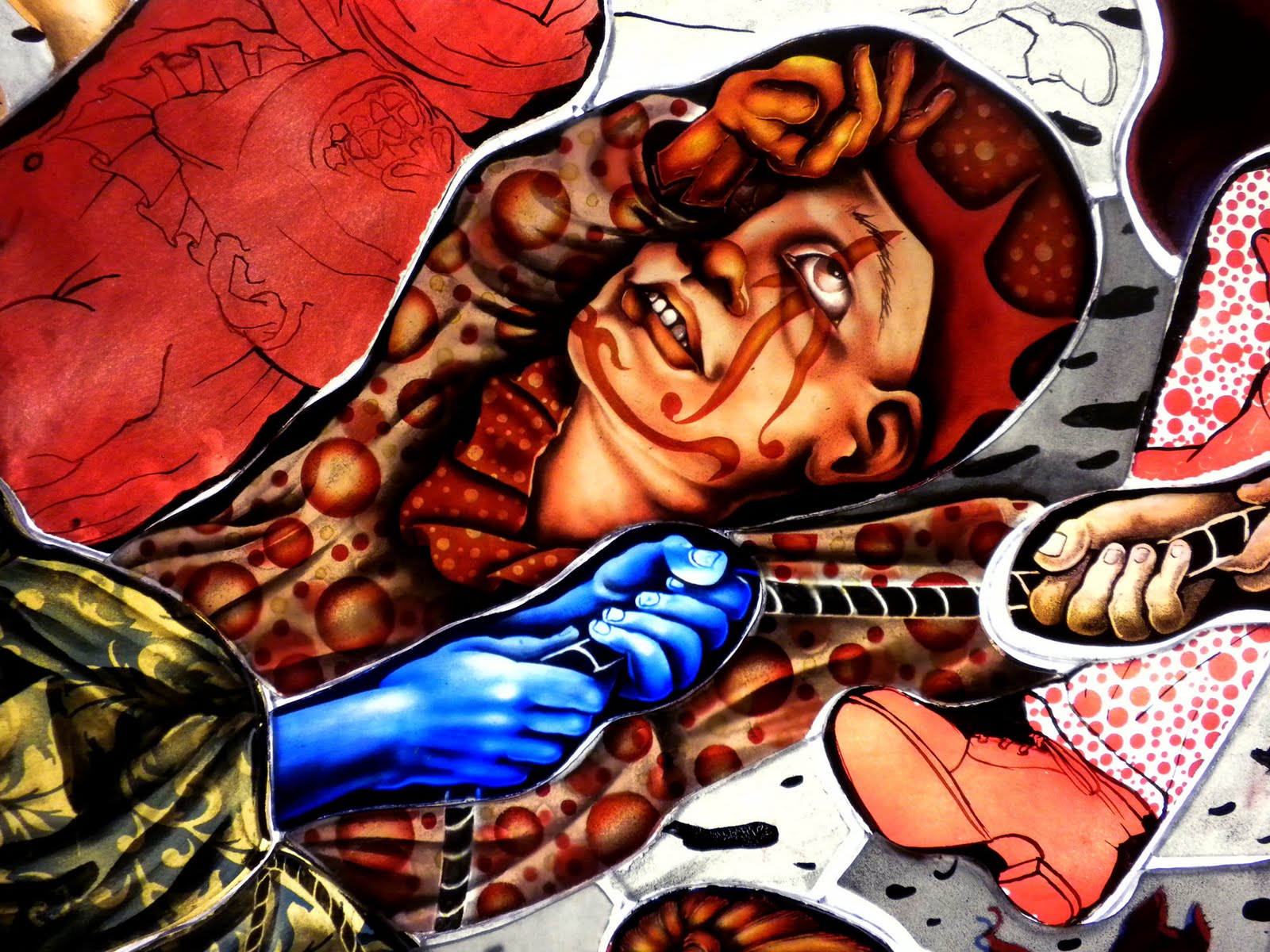
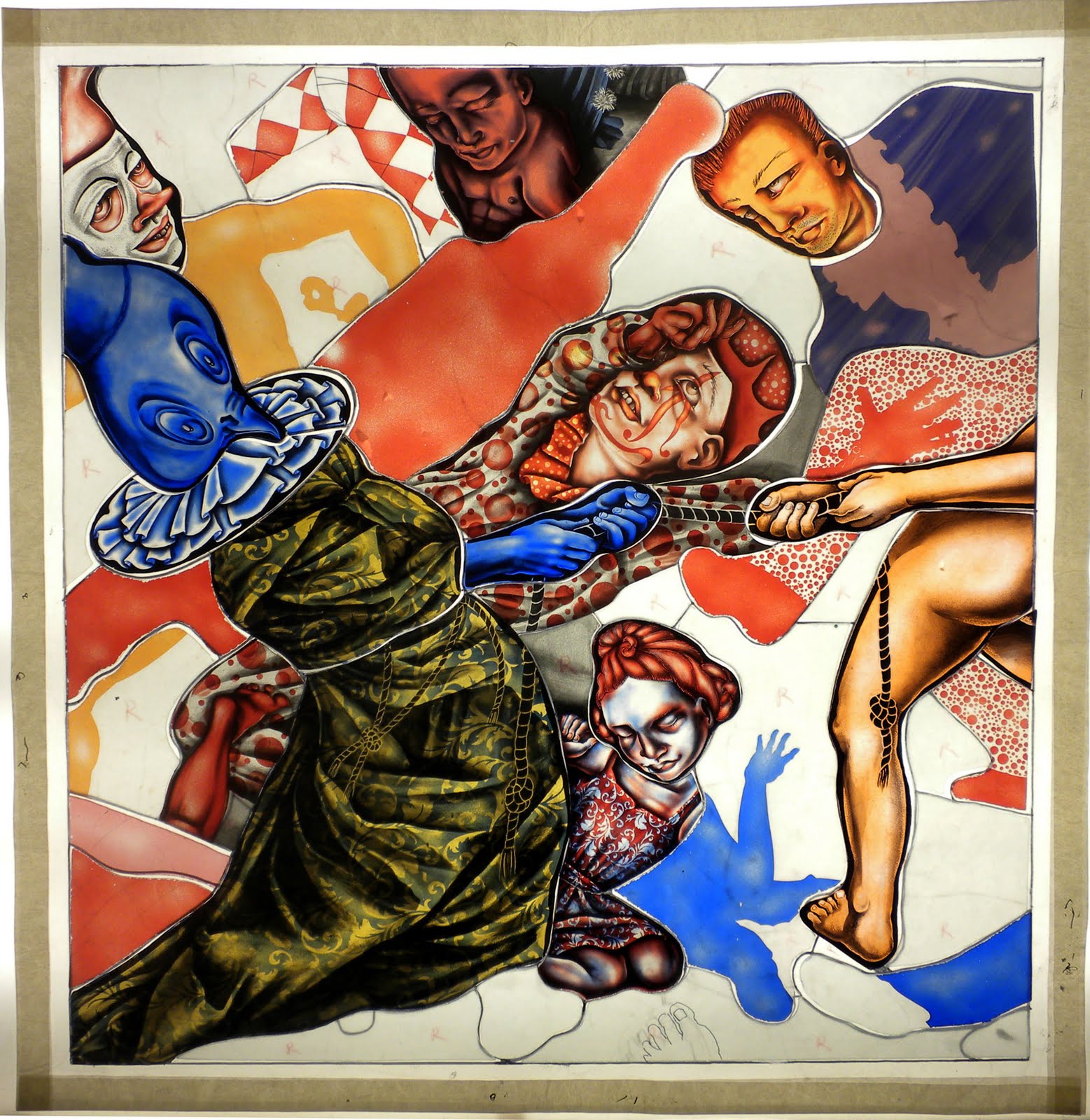
Cute & Creepy
Museum of Fine Arts, Florida State University
530 West Call Street, Tallahassee, Florida 32306
Mon. - Fri., 9am - 4pm, Sat. & Sun., 1pm - 4pm
850 644 1254
Allys Palladino-Craig, DirectorDirector
Teri R. Yoo, Communications OfficerCommunications Officer

The exhibition Cute & Creepy was organized by the Florida State University Museum of Fine Arts in concert with Guest Curator Carrie Ann Baade, Art Department, College of Visual Arts, Theatre and Dance. Project Staff: Allys Palladino-Craig, Grantwriter / Editor; Jean Young, Registrar and Fiscal officer; Teri Yoo, Communications Officer; Viki D. Thompson Wylder, Educational Programming; Wayne Vonada, Chief Preparator; Dalia Grad, Editorial Assistant.
This program is sponsored in part by: The State of Florida, Department of State, Division of Cultural Affairs, Florida Arts Council, and the National Endowment for the Arts; the Arts & Humanities Enhancement Program of Florida State University; the City of Tallahassee State Partners Initiative and the Leon County Cultural Development Program, both administered by the Council on Culture and Art.

Please note my lecture Thursday Oct 13, 7 pm


----------------------
La Luz de Jesus 25

Billy Shire celebrates 25 years with huge group show & book

Part 1 opens October 7 & 8, 8–11 PM
Part 2 opens November 4 & 5, 8–11 PM

My work is in the November show.

To celebrate 25 years of groundbreaking art shows, Billy Shire presents his biggest event ever: La Luz de Jesus 25, a major retrospective exhibition and companion book. The show, offering work by more than 260 artists who have exhibited at the gallery over the years, is so extensive that Shire has split it into two parts, each with two opening nights: part 1 opens October 7 and 8, and part 2 opens November 4 and 5. The list of participating artists is a veritable Who’s Who of art world luminaries. This is a once-in-a-lifetime opportunity to see all these artists together in one show.

View the artist roster for each month here

The book, La Luz de Jesus 25: The Little Gallery That Could, features images of all the art in the show, a personal anecdote about Shire and the gallery written by each artist, essays by La Luz gallery directors and a foreword by Shire. The book is more than a simple record of the show. Taken together, the images and essays present a history of La Luz de Jesus through the eyes of the artists whose careers are intertwined with Shire and his gallery.
About La Luz de Jesus
Billy Shire opened La Luz de Jesus in 1986 to showcase the work of underground and folk artists largely ignored or dismissed by the legitimate art world. The first permanent gallery space to exhibit alternative art, La Luz quickly became famous as much for its splashy, raucous monthly opening parties as for the often outrageous and confrontational art on its walls. When choosing artists, Shire challenged received notions of “good taste” and “high art” and rejected the arbitrary but long-cherished distinction between commercial and fine art, embracing illustration, underground art, outsider art, animation, and comics, both underground and mainstream. As a result, many artists hugely successful today credit Shire with having launched their careers, and he is widely acknowledged as a seminal figure in contemporary art movements such as Lowbrow and Pop Surrealism.

For purchase questions or for more information, please contact gallery director Matt Kennedy at 323.666.7667 or info@laluzdejesus.com
La Luz de Jesus Gallery is located at 4633 Hollywood Boulevard, Los Angeles, CA 90027. <mailto:info@laluzdejesus.com
----------------------

OCT 5-- MIT
The MIT Glass Lab in the Department of Materials Science and Engineering is pleased to present the 2011 Page Hazlegrove Lecture in Glass Art
“Surviving Your Creativity”

Oct 5 6:30 PM Rm 10-250, MIT Campus, Cambridge MA.


----------------------
I will be contributing a piece to this benefit:
.
PAWS no-kill animal shelter benefit- Live Music + CD Compilation + Art show
Time Friday, October 21 at 7:00pm - October 22 at 10:00pm
Location: Digital Ferret732 S. 4th St.
Philadelphia, PA

Sunday, September 25, 2011

5 pm Sunday and the piece looks like this.
Bad doggie!
The three layers comprising the clown. One the left is the glass I mentioned in my last post. It is a piece of regular float glass with silverstain on one side and transparent carmine enamel on the other. (Both of the other layers are lambert's 1001 r/cl b--one with stencil black vitreous paint and the other is silverstained.
Layers of the little girl--goldpink/cl desag, Lambert's 1006 bl/cl b with vitreous paint and Lambert's 1001 r/cl b with silver stain and firepolished)
The hands are painted on aurora on clear. The bottom layer is transparent carmine on float.

Friday, September 23, 2011

Currently the piece looks like this. I have cut glass for the entire piece--although not all the second (or third) layers have been cut.) I have begun roughing out these areas with my usual procedure of sandblasting and painting.
Believe it or not, I am doing some technical experimentation--I want to create "flash glass" by using float glass that has been enameled with transparent carmine #2227 (or is it 2777?) and silver stain (one on one side of the glass and the other on the flip side to facilitate easier manipulation post-firing). I had a few disasters...and I didn't take pics of them. Suffice it to say, the carmine doesn't mix with water and turps makes it turn into a sort of bloody bruised liver color that's opaque. YIKES! I went back to water and made a layer underneath that clown above. It doesn't have the clarity a layer of gold pink glass would have, but it is interesting!
Third layer on the little girl. This is done with gold pink glass (this is a color made by DESAG and is no longer manufactured. I own quite a few sheets of it, but when I run out I will be really mightily sad as it behaves much better than either Lambert's or Saint Just gold pink does. For one thing, the flash layer is nice and thin and pale. It seems with gold pinks, the manufacturer wants to give you as much pink as they can for the money.....but it is TOO THICK and as such it resists being used to create tonal variation with either sandblasting OR filing.) One thing about layering stained glass is generally speaking, thecolors should be lighter than you think. A little color goes a long way! A long, long, long, long way!!!!! Start piling up that glass and you get darkness and murk pretty quick!
I like this convergence of limbs.

Sunday, September 18, 2011

Since we last met.....I started manipulating the second layer--in fact, I re-cut the blue layer on the bird-monk's robe in a lighter blue and sandblasted a pattern on it. I also did stuff (by "stuff" I mean: sandblasting, flex-shaft engraving and diamond filing) to the second layer on the red clown, the little girl kneeling in the foreground and the bird monk's head. I also cut a bunch more glass for some of the other areas.


Photoshop test to see how its coming together

Wednesday, September 14, 2011

Third paint firing. A third layer of paint seems necessary to get deep blacks and for tweaking. I can be a sloppy painter and go back and forth between engraving and painting to get things "right"...whatever that means.
Hey! Its been called to my attention that some of the tech talk is a bit advanced. I don't always have a sense of whom I am writing for...anyway--earlier in the blog, I posted a more basic painting demo which should explain things in much greater depth. This one, too...
should you be interested.
OMG---what's THIS???? I ruinnnnned it!! Probably.... ! But not just yet, I hope.
This is the second layer of glass cut out. As yet--nothing has been done to it so its just plain color...stay tuned.....over the weekend I will start to manipulate this layer and you'll see stuff begin to happen. Much of it is the ever-sublime Lambert's red 1001-r/cl--b the most gorgeous color in the world. its OK for an artist to have a favorite color, right? I like warm, warm reds that veer off into scarlet.
This Lambert's is the only sheet glass I know of that's a warm cherry red. For some reason most glass reds are wine-y or whiny....or browny... Second, it cuts perfectly--like a hot knife through butter. It grinds, sandblasts, engraves and files easily--which makes me think its quite soft. It also soaks up silverstain like a sponge--even when sandblasted and its always well behaved. Except that it tends to scream.
A close up of one of my favorite characters so far.
As always, click for enlargements.

Monday, September 12, 2011

Monday's stuff

Friends, Romans, Countrymen: what's this? What the piece looked like this AM. with the all the pieces made of flash glass engraved. So now they are ready for MORE PAINT, which is much easier than the first go-round and, just because you've been good, provides a super amazing level of return on your investment: meaning: it often looks fabulous.
Here is is with the second layer of paint--on everything but that lovely buttock on the right and the behumbled blue man at the top (well--he's got a shadow, but no detail yet.)(He's getting scythed to death by a ninja lady who may or may not be Pride)
The clown is starting to look like something....I can't believe I am gonna be able to pull off his shirt...wait! I don't mean that the way it sounds!!
More creepy faces. The top one was a surprise to me as the doodle its based on had little detail to go on.
Patience--who's getting her head kicked in by Wrath. I dunno if I bothered to mention it, but there's a number of sub battles here intended to vaguely refer to the Seven Cardinal Virtues versus the Seven Deadly Sins. But very, very loosely. Why? Because it will be better that way, trust me. These things need to work themselves out--not have me dictating their fates to them.

Sunday, September 11, 2011

Sunday's work

The piece as it looked this morning. After sandblasting the glass and marking it with a pen, I paint the first layer and fire it. Specifically--I wipe Reusche Stencil Black 1059 onto the sandblasted surface with a dampish paper towel and then wipe the excess off. THEN! I go over all the magic maker lines with a thin liner brush and paint them in....for your glass folks who know something about glass painting, this is my version of doing the first matte and trace but I am total cheater since I am using sandblasted glass. (The exception is the naked bits which I painted directly rather than wipe. Why? Because it seemed like a good idea??)
I fire at 1213 F. UP in 25 mins, open the kiln to 1050 and then put two bits of fire brick in to crack the door very slightly (otherwise it will take up to five hours to cool which is not necessary). It cools (and anneals) in about 2 or 3 hours this way.
Then, I went into it with a flexible shaft engraver using diamond ball burrs and also 3-M diamond files and started defining the highlights. This technique is so physically taxing (even after years of doing it often), I type this with almost totally numb fingertips and you can see I did not finish today.
Some close ups. Hey! Don't get any ideas about me going fast. Each of these areas will ultimately be two or three pieces thick to get in all the color and detail I am lookin' to get. So while a head may be blue now....it won't be later--this is akin to an underpainting and has little bearing on how it will look when its finished.
By the way....I hate clowns.

Saturday, September 10, 2011

Carnival and Lent in prog


I'd like to attempt to copiously document the making of this piece--for my students and any others interested in my working methods, techniques etc etc. So here goes.
Above is the photoshop document printed out at actual size hanging above my light table. Inspiration or ominous threatening reminder of my deadline? Who can say....
The piece needs to be done before March and my best time estimates would put the ETA at.....2013! The pieces contains 95 figures. All of which must be fabulous or I will not have done my job. Meanwhile, I am teaching three three credit courses, which is full time. Oh yeah--that's some wacky time management issue!
First version of the cartoon (cutting pattern) for the bottom middle section on top--I simplified it below. A catrillion cut lines doesn't make a piece better or even more intricate. It is not necessarily "lazy" to make fewer or a sign of obsessive devotion to make more. I felt like I would be able to make the image with fewer so I got rid of some.

This is how I "plan color". Hahahaha! As you can see, its a big joke as I am barely even trying...just splashing some colors around so I have an idea of what glass to cut. I then immediately diverged from the plan, as I am wont to do. I.e. the Bird-monk playing tug-a-war with the naked clown is wearing a blue robe in the color sketch but I cut it out in yellow below. Maybe I will put a blue layer on top of that.
I cut some glass....
Then I sandblasted it. Just enough to cut into the surface and rough it up some. Show it who's boss...
OK--I then sandblasted the pattern into the clown suit. Just because I fancied the idea. The markings on the glass are done with a razor point sharpie. This is because I intend to paint these details in and the pen guides me--it burns off when the paint is fired on.

I think its important to note that I'm not operating on any kind of preconceived notion that I know what I am doing. I really DON'T! I have no clue how to make this window--I only know how to make something once its done. Does that make sense? I mean--I know how to cut glass and solder it together...but I do not know how to make this image YET...I am just acting and then reacting and on and on it goes...
stay tuned.
Any questions?